Guy Mees Guy Mees
10/03/2017 – 15/04/2017
Eröffnung: Freitag, 10. März, 2017, 19 – 22 Uhr
Opening: Friday, March 10, 2017, 7 – 10 pm
Galerie Nagel Draxler
Weydingerstr. 2/4
10178 Berlin
Öffnungszeiten / Hours:
Dienstag – Freitag: 11 – 19 Uhr / Tuesday – Friday: 11 am – 7 pm
Samstag: 11 – 18 Uhr / Saturday: 11 am – 6 pm
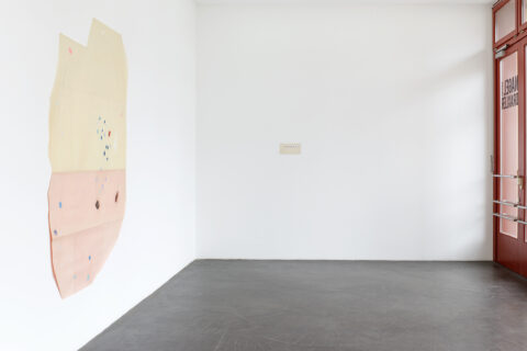
Ausstellungsansicht, 2017
Galerie Nagel Draxler, Berlin
Photo: Simon Vogel
Ausstellungsansicht, 2017
Galerie Nagel Draxler, Berlin
Photo: Simon Vogel
Ausstellungsansicht, 2017
Galerie Nagel Draxler, Berlin
Photo: Simon Vogel
Ausstellungsansicht, 2017
Galerie Nagel Draxler, Berlin
Photo: Simon Vogel
Ausstellungsansicht, 2017
Galerie Nagel Draxler, Berlin
Photo: Simon Vogel
Ausstellungsansicht, 2017
Galerie Nagel Draxler, Berlin
Photo: Simon Vogel
Ausstellungsansicht, 2017
Galerie Nagel Draxler, Berlin
Photo: Simon Vogel
Ausstellungsansicht, 2017
Galerie Nagel Draxler, Berlin
Photo: Simon Vogel
Ausstellungsansicht, 2017
Galerie Nagel Draxler, Berlin
Photo: Simon Vogel
Ausstellungsansicht, 2017
Galerie Nagel Draxler, Berlin
Photo: Simon Vogel
Ausstellungsansicht, 2017
Galerie Nagel Draxler, Berlin
Photo: Simon Vogel
Ausstellungsansicht, 2017
Galerie Nagel Draxler, Berlin
Photo: Simon Vogel
Ausstellungsansicht, 2017
Galerie Nagel Draxler, Berlin
Photo: Simon Vogel
Ausstellungsansicht, 2017
Galerie Nagel Draxler, Berlin
Photo: Simon Vogel
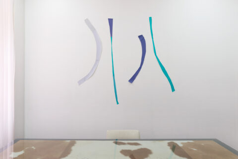
„Verloren Ruimte“, 1986
Papier (grau, grün und blau)
180 x 180 cm
Photo: Simon Vogel
Ausstellungsansicht, 2017
Galerie Nagel Draxler, Berlin
Photo: Simon Vogel
Ausstellungsansicht, 2017
Galerie Nagel Draxler, Berlin
Photo: Simon Vogel
Ausstellungsansicht, 2017
Galerie Nagel Draxler, Berlin
Photo: Simon Vogel
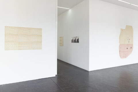
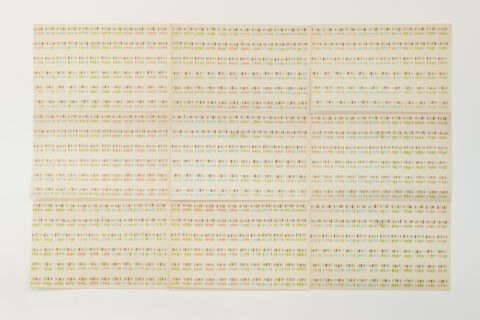
ohne Titel, 1970
Filzstift auf Papier
127 x 81 cm (9-teilig)
Photo: Simon Vogel
ohne Titel (KP-040), 1970-75
Pastellkreide auf Papier
125 x 161 cm
Photo: Simon Vogel
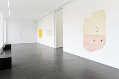
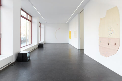
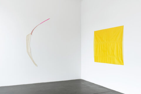
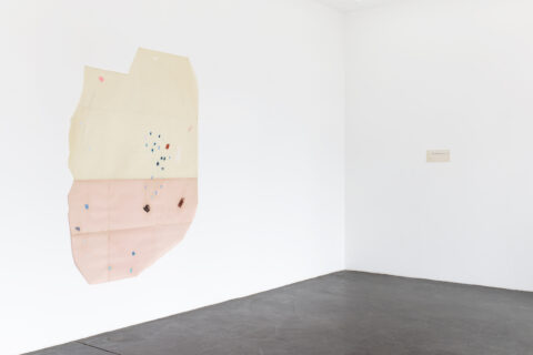
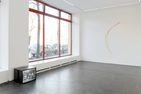
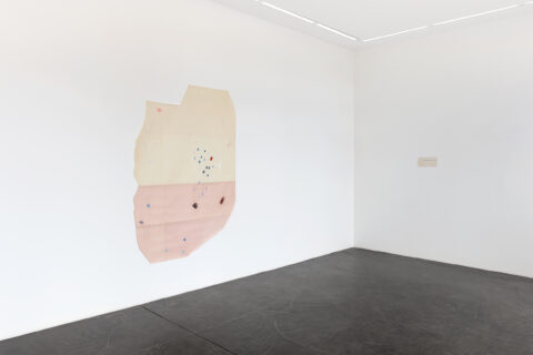
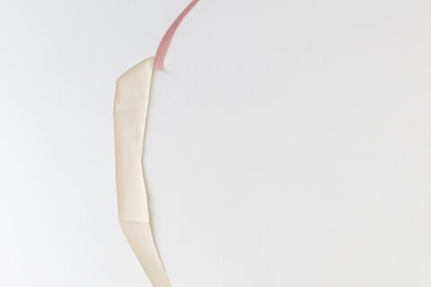
„Verloren Ruimte (VR-078), 1985
Papier (weiß, altrosa, pink)
200 x 125 cm
Photo: Simon Vogel
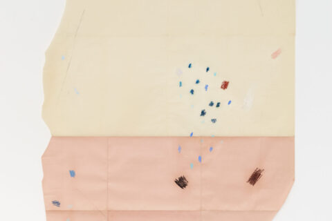
ohne Titel (KP-016), 1983
Pastellkreide auf Papier
210 x 135 cm
Photo: Simon Vogel
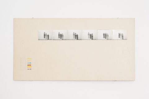
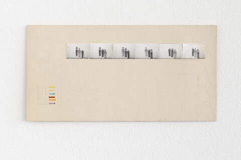
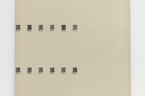
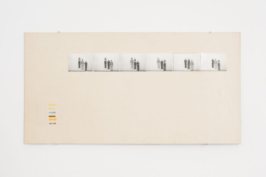
ohne Titel, 1970
Filzstift, Buntstift und s/w-Fotografien auf Papier
15 x 29,5 cm
Photo: Simon Vogel
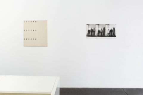
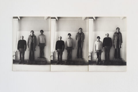
„Niveauverschillen (NV-017)“, 1971-72
3 s/w-Fotografien
je 39 x 27,3 cm
Unikat
Photo: Simon Vogel
„Niveauverschillen (NV 003), 1970
Karton, Bleistift und s/w-Fotografien
72 x 65 cm
Photo: Simon Vogel
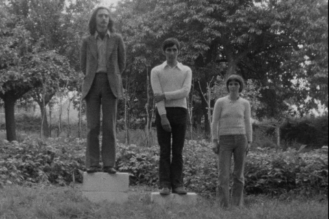
„Portretten“, 1971
16 mm s/w Film
Ton
3 min 30 sek
Edition: 2/3 + 2 AP
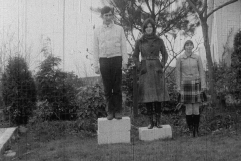
„Portretten“, 1969
16 mm s/w Film
Ohne Ton
2 min 23 sek
Edition: 2/3 + 2 AP
Press Release
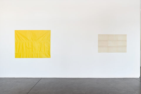
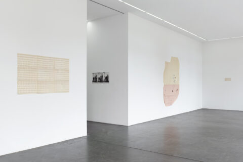
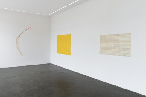
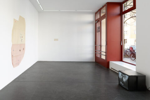
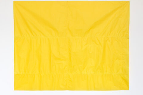
Galerie Nagel Draxler and Micheline Szwajcer are pleased to present works by Belgian artist Guy Mees (1935-2003). It is the first exhibition by the artist in Germany and gives a short introduction into his fantastic œuvre, that mainly consists of fragile paper works, photography and video. Starting with his first series Verloren Ruimte (Lost space) from the early 60s, followed by the series Niveauverschillen (Levels) from the early 70s, and his pastel colours from the early 80s, a second series named Verloren Ruimte, comprised of coloured stripes of paper cutouts pinned directly to the wall, completes the display.
The following are excerpts from Dirk Snauwaert in „Guy Mees“ (Ludion, 2002):
The title verloren ruimte – ‘lost space’ – is a recurrent theme in Guy Mees’s work. He first used this term for a group of works with industrial lace, sometimes incorporating neon light, which were created between 1960 and 1966. They comprise both two-dimensional reliefs and free-standing sculptural volumes. (….)
In the early 70s he started with his series of „Portraits“ called „Levels“ or „Niveauverschillen“ which consists „of photographs of very varied formats, ranging from contact prints, via ordinary family photographs in black and white and color, to large-format studio quality shots. Again the execution is very unartistic, fully coinciding with the principle of anonymity or the photographs intensionally made to look like amateurish snapshots in conceptual photography. (…) The photographic portraits, far more than the films, have the appearance of cast studies of a micro-group. The people in the portraits pose frontally and usually against a neutral background, giving a flat impression. The slight differences, in stature and size and also in facial expression and the positioning of the arms and hands, are more striking as typological than as individual features. (…)
Variation according to a seemingly logical mathematical system led Mees to another series of works on paper. The drawings done on A4 sheets, initially intended as working drawings, were subsequently brought together on one carrier to make one large ordered field. The grid structure with its arrangements of columns reinforced the regularity and systematic character. From 1970 Mees worked on this new series of works consisting of prints or stripes of colored felt-tip pen in columns below or net to one another. The whole series can be interpreted as a system of classification or notation of a controlled system of change, again a method of eliminating notions like creativity and inspiration.
Around 1983 Mees started with his pastel colours (…) to which are now given independent character in that he cuts the shapes directly out of coloured paper and combines them into a composition.
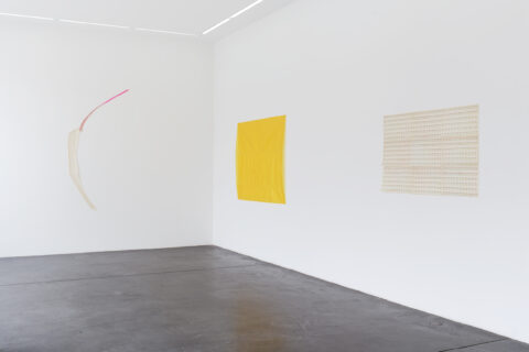
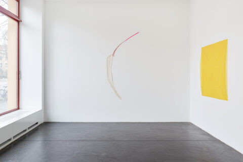
(…) the wall reliefs soon evolved into an open structure with a directed movement and a tense rhythm. Because of the way the shapes are fixed to the wall – pinned directly to it – the wall fulfills a dual function: literally, of course, it closes off the space in which the reliefs are hanging, while figuratively it also forms part of the composition as the negative shape, the projection wall against which the composition of colours stands out. (…) with him the drawing never possesses the elegantly flowing lines of classic modernism: it always shows bends and serrated edges, which underline the precarious, aleatory nature of the composition. Apart form this there is also the constant interchange between reflective and absorben textures. Mees uses matt, shiny, semi-matt and metallic kinds of paper, sometimes even newspaper, textiles or painter’s canvas and aluminium foil. (…) These works articulate conceptions of space that make interpretive and reflective viewing possible and – away from the passive, deferential contemplation that leads to immersion – structure the act of being absorbed into a space of purely optical weightlessness. There is a playful, frivolous lightness here that allows the content and the optical aspect to merge into a symbiosis.”
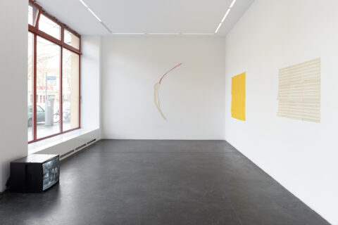
Between the mit 1980s and the early 1990s Guy Mees used the title „Lost Space“ again for a new series for which he constructed colored strips of paper cut-outs into wall reliefs, which he pinned directly to the wall. The explicit negation and the mysterious overtones of the title, which is reminiscent of magic realistic literature, is in a stark contrast to the explicit, visual sensuality of these works. (…) The ‘lost space’ is both a textual and a visual reference to the shattered pictorial space, where not only the act of painting, but also the representation and the bordering framework are called into question. (…).
